Instagram has undergone a redesign, which sees the social media platform replace its vintage camera icon for a more minimal symbol.
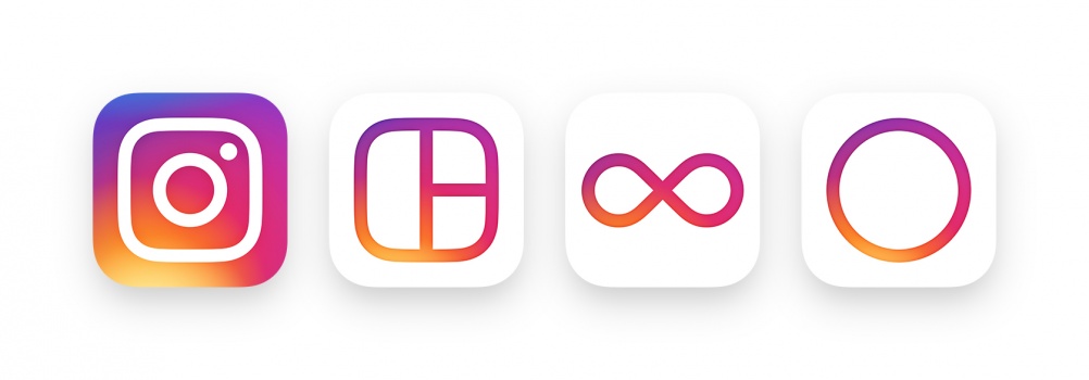
The refresh has been completed by Instagram’s in-house design team, and also includes a redesign of its partner apps Hyperlapse (a video recorder), Layout (an image collager) and Boomerang (a gif maker).
The new look aims to “unify’ all of the different apps with the same style, in line with how Instagram has developed as more than just a place to edit and share photos, says the app.
Instagram’s well-known previous logo was a life-like vintage camera with a rainbow mark – the new logo sees a cleaner, flatter symbol, which reimagines the rainbow as a gradient that seeps over the whole icon.
The camera shape is reimagined through a series of flat shapes: a soft square, with a circle and a dot contained within it, representing the lens and viewfinder of the camera. During the design process, the in-house team found the lens, viewfinder and rainbow were the most distinctive features of the original logo, after people were asked to draw it from memory.
The system of icons for other apps includes a set of divided squares representing a composition of photos (Layout), an infinity symbol representing a video looping continuously (Boomerang) and a circle representing a video camera lense (Hyperlapse). All three use the same colour gradient as the Instagram icon.


